HAUT
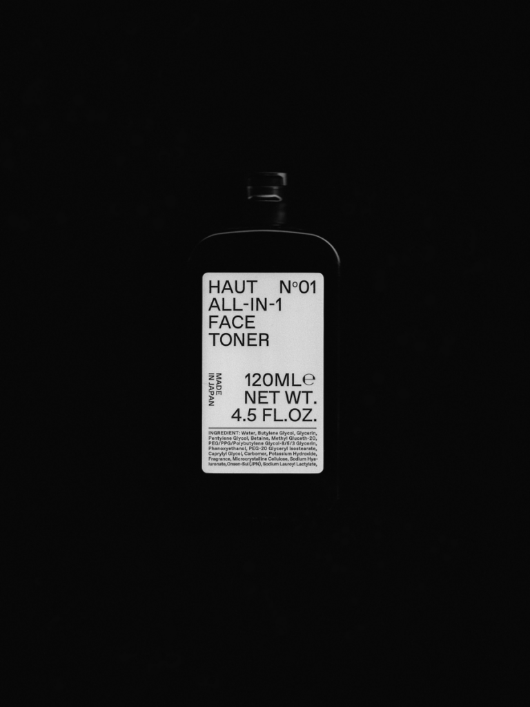
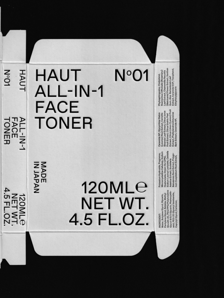
メンズスキンケアブランド「HAUT(オウ)」のアートディレクションおよびデザイン全般を担当。ブランド名の由来でもある“肌(Haut)”に真摯に向き合い、プロダクトの特性や思想が可視化されるよう、視覚言語の構築を行った。パッケージデザインにおいては、タイポグラフィを主軸に据え、ブランド名、内容量、主要成分の表記をあえて前面に配置。情報を隠すのではなく「開示する」姿勢をデザインとして打ち出すことで、製品への信頼感と透明性を印象的に伝えることを目指した。また、成分そのものの選定にも通じる“誠実さ”が、意匠全体にも一貫して現れるよう、細部に至るまで丁寧に設計している。
I was responsible for the overall art direction and design of this men’s skincare brand.
The design emphasizes typography, displaying the brand name, volume, and key ingredients prominently on the packaging.
This approach aimed to convey both the careful consideration given to each component and the transparency of the formulation itself. By placing the ingredients at the center of the visual narrative, the brand communicates that the design begins at the molecular level.
HAUT